 Administrator
 9 years ago
Improving the mobile experience
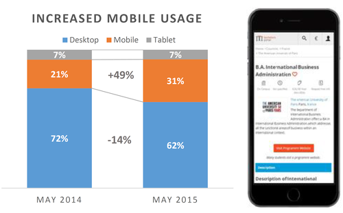
With the widespread use of smartphones, the way prospective students have been using the internet has changed drastically. You may expect that tasks such as researching study options are way less affected by this trend than social media platforms for example. However, our statistics prove different! In April 2015, more than 37% of our users visited bachelorsportal.eu with a mobile phone or tablet, an increase of 49% compared to April last year.
Anticipating this trend, we have been working on a new, responsive design within the past months and are currently rolling it out across all our websites. Responsive means that our websites dynamically adjust to the device of the user, ensuring a great user experience no matter if you use a mobile phone, tablet or desktop computer.
Google is boosting the ranking of mobile-friendly websites
Additionally, Google recognised this trend as well and announced a change in their search algorithm, boosting the ranking of mobile-friendly websites when a user is searching on a mobile device.
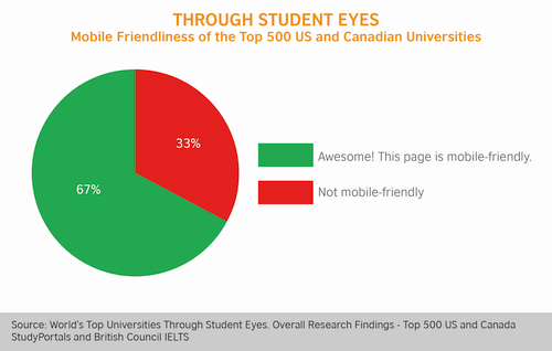
The good news: even if your university website is not mobile ready (and our Top 500 research revealed that 1 out of 3 are not), you can benefit from this boost if you have your study programmes listed on one of our websites.
For more updates, follow us!