Studyportals new look is a win-win for students and universities
Studyportals is rolling-out a new look for the programme pages on Mastersportal.com. A fresh layout and design presents the university programmes more attractively, makes the information easier to process and better supports students to decide on their next move.
The new look addresses key user feedback and the results we see in our A/B tests are very good: Students are positive and the engagement with the university content is substantially higher. Go check it out!
For students, study choice can be a lengthy and complex process. It is Studyportals’ mission to bring transparency to international education. We do this by supporting students along their journey to decide upon and apply for their dream study programme. Studyportals not only provides relevant information for the programme selection and comparison, but also provides information about scholarships, student housing, other students’ experiences and much more.
After several iterations, feature additions and content adjustments in recent years, the user experience on our portals had become cluttered. A growing number of visitors told us how they had trouble finding what they needed and were missing inspiration and appeal on our websites. Knowing how important reliability and trustworthiness are in the decision process for such a live event, we concluded that the original structure and layout no longer optimally supported our users’ and business goals. Mastersportal.com was ready for a make-over!
With our visitors – their journeys, their needs and goals – as a starting point, we redesigned the structure and page layout to better present the required information and support the students to achieve their goals. We’re excited to share the new look of Mastersportal.com.
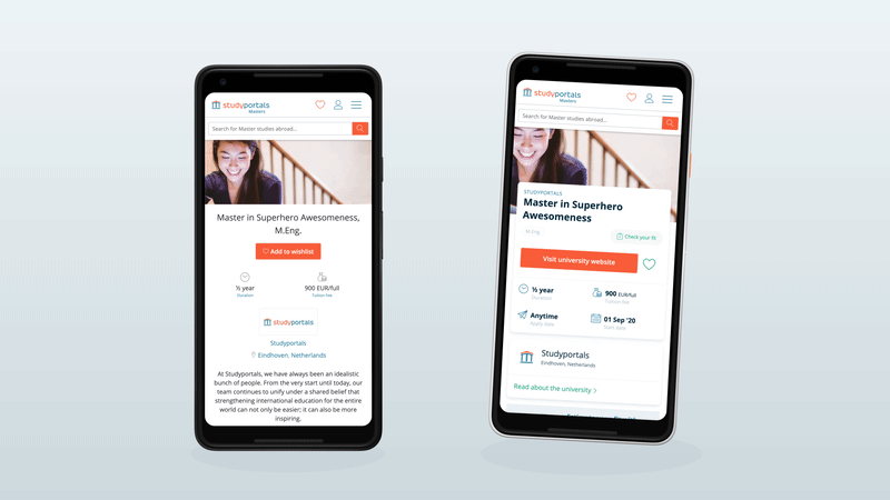
For the new design, the information itself is not changed . The need for this information to help students in their decision journey is unaltered. The key aim is to make the information easier to absorb and to guide the student from one stage in their journey to the next. In the examples you’ll also notice less blocky text components, more visuals, and clear next steps. Below is the new experience on a desktop.
A lot of effort was put into updating the visual design and interaction to the latest standards, but also into making sure that our visitors are happy with the new design. Asking for feedback is tricky when you want to get a pristine, unbiased opinion! That is why we conducted a combination of tests:
- First impression tests (showing the page only for a few seconds, asking for their opinion, and then comparing the results with the original design)
- Visual appeal test – using the VisAWI framework – to evaluate their opinions with an established methodology.
What we learned is that students experience the new look as more organised, more clear and more appealing than before. The positive results on both tests gave us confidence that we were on the right track! Usability testing then also confirmed that the new look made users more effective in finding the information they needed to select a well-fitting programme. Via A/B testing – a method to compare two versions of a webpage with actual users to determine which one performs better – we could measure the actual impact of the new page design on the engagement with the content.
The conclusion? The new look is a win-win: Students are better supported, and more matches are made between well informed students and best-fitting university programmes. This new design will be rolled out to other areas of our portal in the coming weeks. Go check it out!
For more updates, follow us!